How I successfully drove design system adoption and bridging between design with engineering
As a UI designer at HSBC for 3 years, I led scalable design system adoption across 5 financial products, streamlining end-to-end experiences in a complex global ecosystem.
Fintech
UI
Design Systems
Branding
Governance
Documentation
iOS, Android, web

Navigating Complexity with a Scalable Design System
PAIN POINTS
We faced two core challenges in refining HSBC’s design system and ensuring consistency:
Balancing global standards with regional requirements was difficult due to legacy infrastructure, regulatory differences, and cultural expectations. Integrating modern, scalable components often required working around outdated systems.
Managing platform diversity across web and mobile added complexity. We needed to deliver personalized experiences for insurance and investment products while maintaining consistency in core retail banking interfaces.
My Role
I collaborated with product, design, and engineering teams to deliver a cohesive insurance experience while driving design system governance, documentation, and adoption. My focus was on ensuring cross-team alignment, design consistency, and flexibility, fostering a foundation for continuous innovation.
Defining Scalable Components with Modular Personalisation
SOLUTION
I developed scalable, standardised UI components that supported modular customisation across financial products, enhancing usability while maintaining consistency.
Reducing Friction in Form Completion through Visual Clarity
To address form fatigue in HSBC's Voluntary Health Insurance Scheme (VHIS) Flexi Plan, I improved input fields for clarity and responsiveness, especially on smaller screens. Icons and cards were used to break steps into digestible sections, reducing cognitive load.

A quicker viewing process in get a quote page.
I used conversational headings with supporting subheadings to make the form more human-friendly, and added an avatar to create a personalised, approachable tone.

Conversational headings and personalisation when choosing a plan.
Data was vertically stacked to emphasise hierarchy, with borders removed to reduce visual noise and highlight key values over categories.
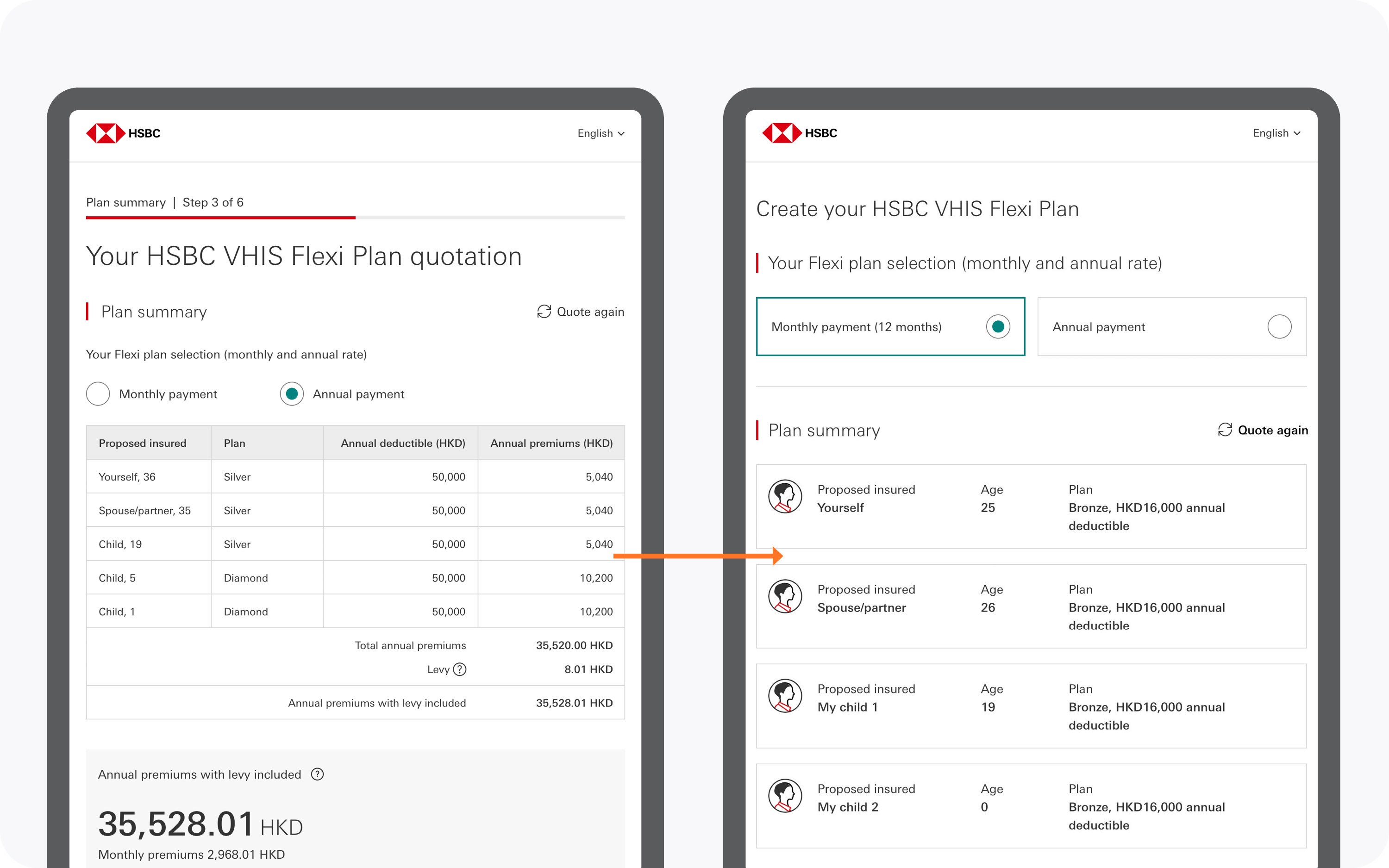
A clear and concise plan summary for insured individuals.
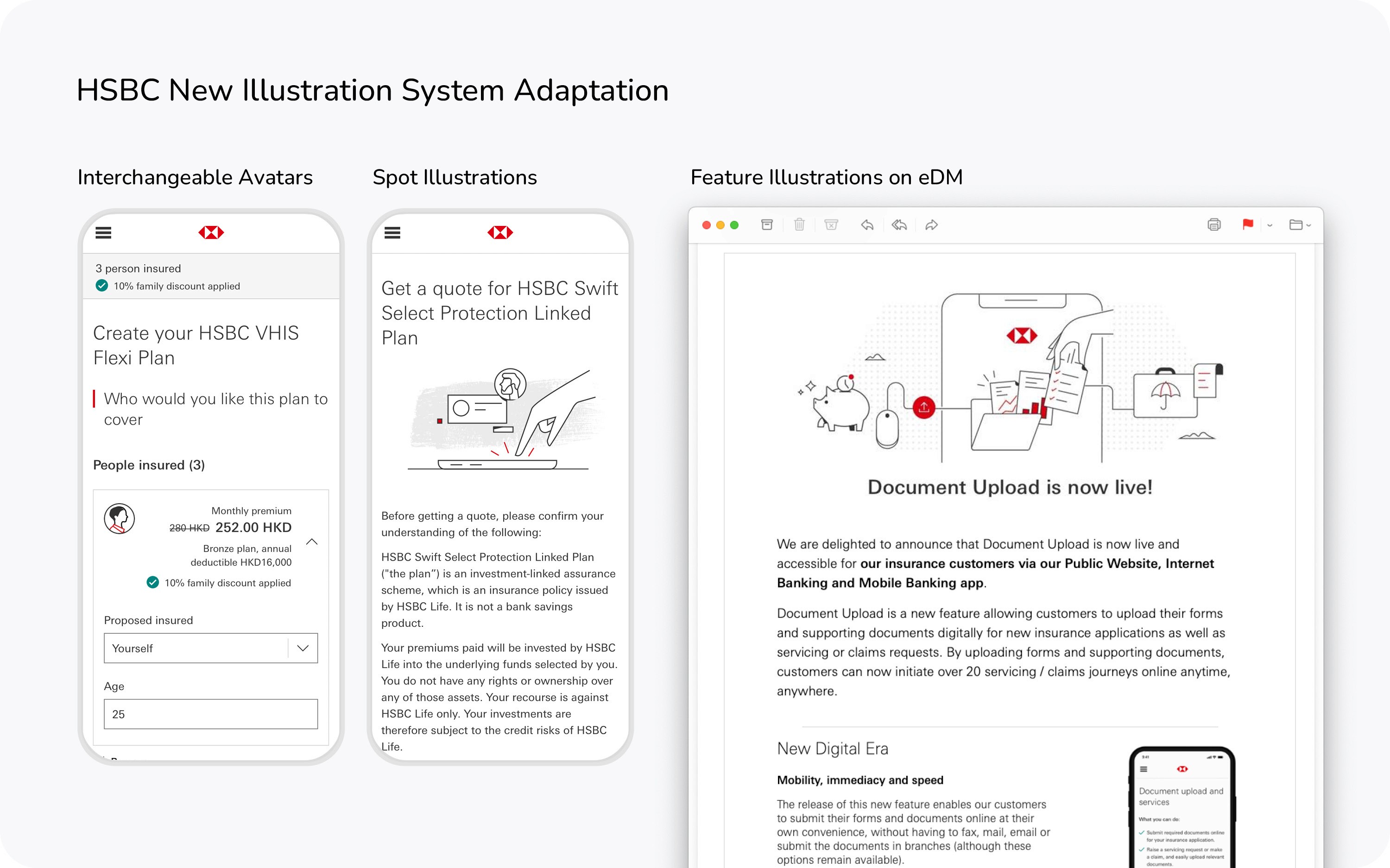
Driving Brand Cohesion Through Visual Alignment
I aligned illustration styles and colour schemes with HSBC’s global brand to ensure visual consistency across regional products. Despite style variations across channels, I adapted and refined visuals to maintain cohesion.

Varied illustration styles and colour schemes across range of products.

Visual assets I recreated based on existing styling.
I referred to HSBC’s new Illustration System as a reference to standardise feature illustrations, ensuring alignment with brand guidelines. My focus was on maintaining consistency across mobile core service while adapting to localisation needs in wealth and insurance products.


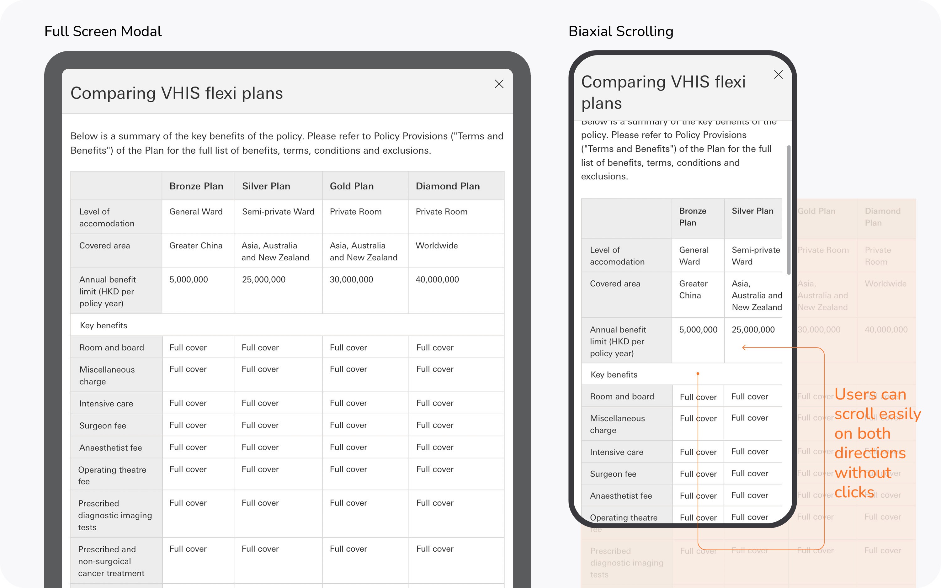

Ensuring Platform Consistency through Data-Driven Decisions
SOLUTION
I applied responsive design principles and user testing insights to refine UI components and regional content.
For example, user research on Swift Save insurance showed a preference for mobile in quick tasks and desktop for research. This informed a clearer landing page design, with concise content and key details like investment limits prioritised for better usability.


Scaling Design with Flexibility and Collaboration
LEARNING & NEXT STEPS
Working in HSBC’s complex ecosystem highlighted the need to balance standardisation with flexibility. Achieving consistency across platforms requires close collaboration between design and engineering.
A key takeaway is that scalable systems must adapt to evolving product needs and regional differences. The challenge remains in aligning design goals with engineering capacity and timelines.
Looking ahead, improving system governance, refining responsive guidance, and enhancing design-dev collaboration tools will help scale human-centered design without compromising delivery.
How I transformed customer data into value through out-of-the-box gamification
I introduced gamification strategy to the dashboard to strengthen customer engagement and reimagine brand experience.
Banking and Insurance
Personalisation
UI
Design System
Gamification
Branding
Data Visualisation

How I led UI design and supporting agile sprints to simplify complex insurance products, boosting online sales by 30%
I partnered with the product team to design the end-to-end B2C experience for HSBC Family Protector, the market’s first digital insurance solution with flexibility and personalisation.
Insurtech
Business: B2C
UI
UX Strategy
Project Management
Usability Testing
iOS, Android, web